Sorry, I don’t have quick tips to give you about design. It’s such a deep and interesting topic and an art that I’ve studied and experimented with for a long time. What I can do, in the form of a one-way blog post, is tell you some basic principles that I use, and show you examples of design that I just like.
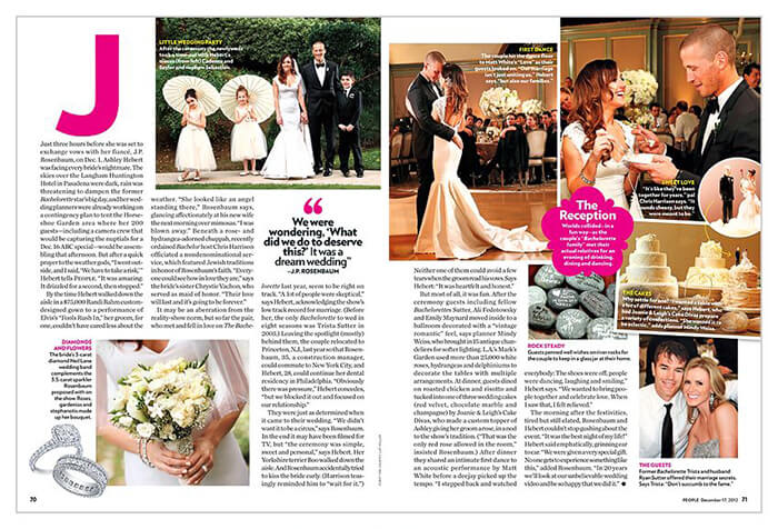
So, I Googled “People Magazine Layout” and found this image. They have all the right things going on, but too much of it. What do I look at? What’s important? Yes, you are supposed to just read it from the beginning, but nothing is catching my eye. The creators could easily fix it, by keeping a few things in mind.
White space
“White space, also known as “negative space,” is empty space around the content and functional elements of a page. The basic role of white space is to let your design breathe by reducing the amount of text and functional elements that users see at once.”
(Side note: I don’t like that this definition uses the word empty. It implies that something should be there, or that your page needs to be full to be useful. But it does a good job at explaining everything else.)
If you remove some elements, you can place the remaining ones in better places to help tell the story. For example, the quote can become a focal point to highlight a moment or feeling just like an image.
Asymmetry
“Asymmetry is the absence of symmetry. In design, asymmetry is often used to create visual tension. Designers typically create asymmetrical layouts to bring attention to a particular area or elements on the page.
Symmetrical layouts can be easier on the eyes. Since symmetrical design has built-in order and stability, it becomes easier for the brain to comprehend information.”
I think centering things works about 99% of the time. People love it; we are for some reason drawn to even things. However, nothing in nature is even. Our bodies aren’t perfectly aligned, and that’s still beautiful. When there is enough white space and asymmetry combined, you create tons of contrast and interest. You can still center things and use white space. I’m not saying symmetry is bad, but in my opinion, asymmetry really pushes design.
The magazine layout is technically asymmetrical, because nothing matches up perfectly. But it’s not using the space to enhance the asymmetry. It’s only trying to fill the page.
Hierarchy
As you think about those, the last and probably most important thing in design is hierarchy—giving importance to certain things throughout the page. That can mean making headlines big or bold. It can also mean using the ideas from above to create a distinction between elements. You can separate your headline from everything else. Maybe you place it in the bottom corner instead of centered. There are tons of things you can try, but make sure as you add more to the page, things don’t compete with your highest hierarchical element or with each other.
So, in our magazine, what would be the most important thing? Title? Images? Caption? I really don’t know.
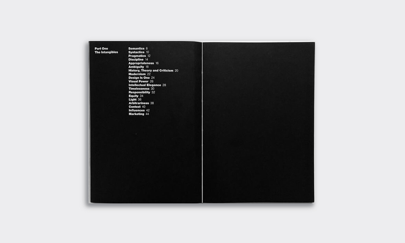
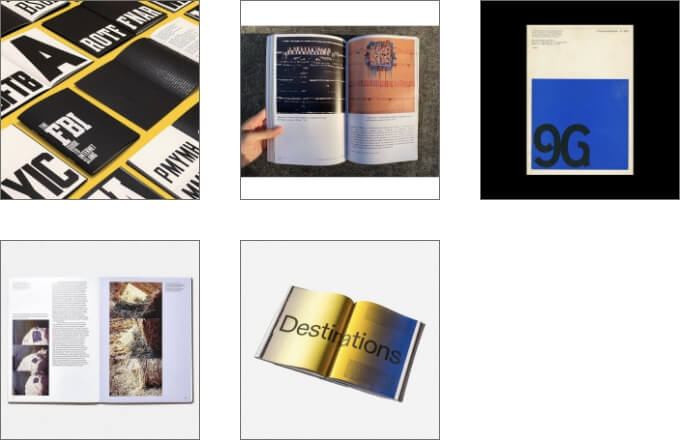
To compare, here are some of my favorite types of designs to see.
I lied, I’ll give you a tip. Be clear on what you’re saying, and use the space correctly considering the three fundamentals above.
*I really love that heading image.