Hi, welcome back. Every once in a while, we break up our enrollment talk with something that applies to all marketers regardless of the industry…design. Please check out my other blog post, “Three Tips from Waybetter’s Designer,” for a preview of what I discuss in more detail below. In that original post, I admitted:
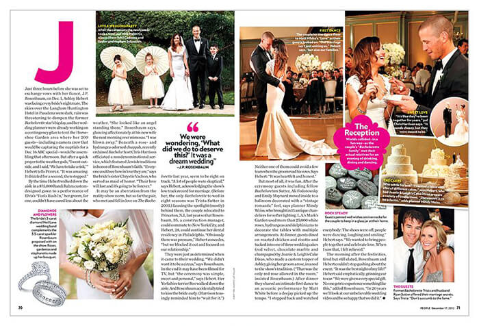
“I Googled “People Magazine Layout” and found this image. They have all the right things going on, but too much of it. What do I look at? What’s important? Yes, you are supposed just to read it from the beginning, but nothing is catching my eye. The creators could easily fix it, by keeping a few things in mind.”
Let’s look again at that People Magazine image, and examine the elements. We have body copy, images, pull quotes, captions and a big ol’ J (which we don’t need here). All of these things can be useful elements. We just have to think a little more about hierarchy and the grid, which is a new concept I will try to explain.
Before we get there, let’s talk about hierarchy again.
The hierarchy goes further than the designer. The writer would need to decide which things they wanted to discuss. Here, they have the story within the long body copy. There are captions about cake, rings, rocks, and guests–it’s a lot. I bet something could be cut, or the designer needs another page or two.
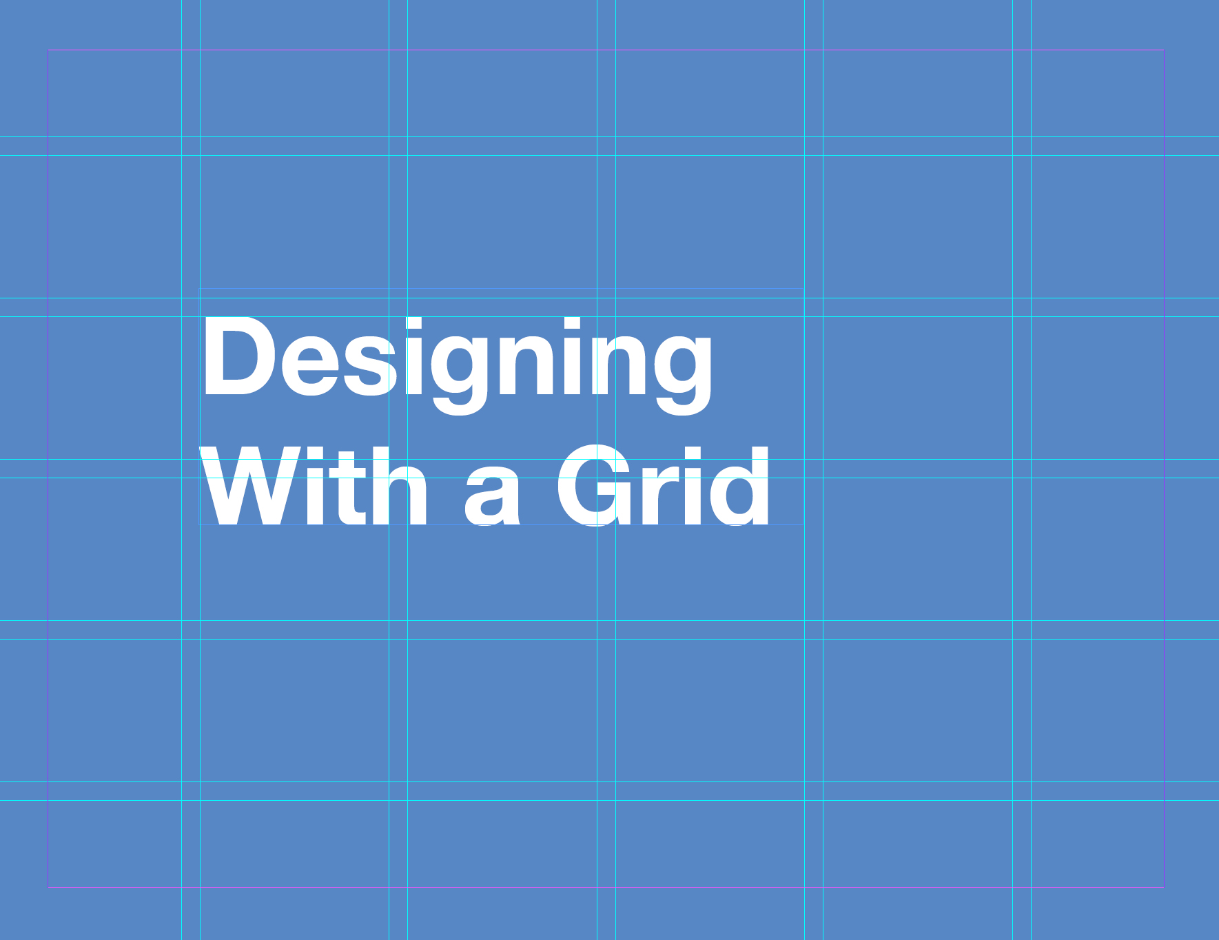
Back to the grid.
Grids are important because we need a guide and boundaries to follow, and we want consistency in the magazine. You can see that they did this because each page has 3 columns. When using an element, you can span any amount of the columns and go across the middle if you want. It’s just important to place things on the lines of the grid. We want structure so the design isn’t messy. The grid can be complex. It can do whatever you want. Just be sure to follow it as much as possible. It’s hard to explain, but you can break it, and I do a little in my sketch that you’ll see soon.
Rather than a final solution, I’d like to explain how I’d begin using the grid. And where the hierarchy comes in.
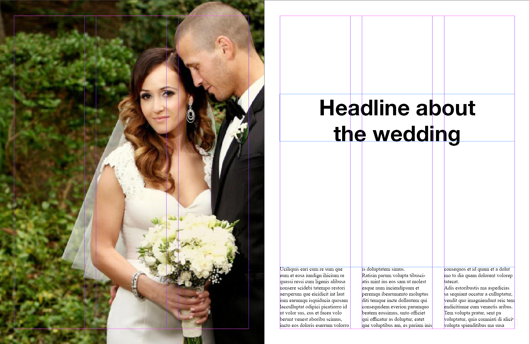
We have 2 spreads to tell the story. Headlines give a lot of information and opportunities for a fun design. Choose the size and fonts well. You could begin the copy on the 1st page and finish it later. There is a lot of contrast on this page. Big copy stands out, and there’s nothing competing with it.
Page 2 could begin with a quote that functions as a subhead. The reader flips and sees that, reading it right away. The reader glances at the images and captions, and then finds their way back to the copy since they are still invested in the story. As you can see, everything is aligned on the pink grid lines giving structure to the design. There are also things aligned horizontally for the same reasons.
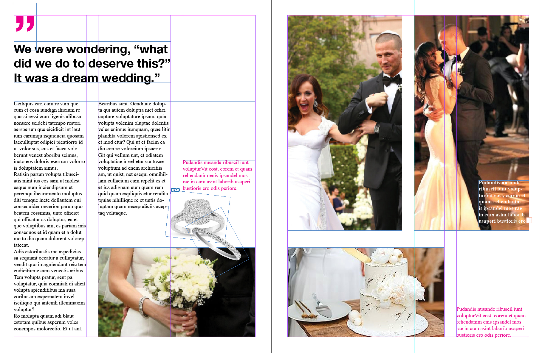
I added little bits of color so the captions stand out from the copy. I’m fine with someone reading those before the copy because they offer quick summaries. I also don’t think every picture needs one. There are a few to attract the reader, but we want them to get to the body copy eventually.
We can do many things with these elements but don’t forget the grid and hierarchy. They set the reader up for success, and direct them around the page in a logical and organized fashion.
For no reason, I chose an old article about The Bachelorette.